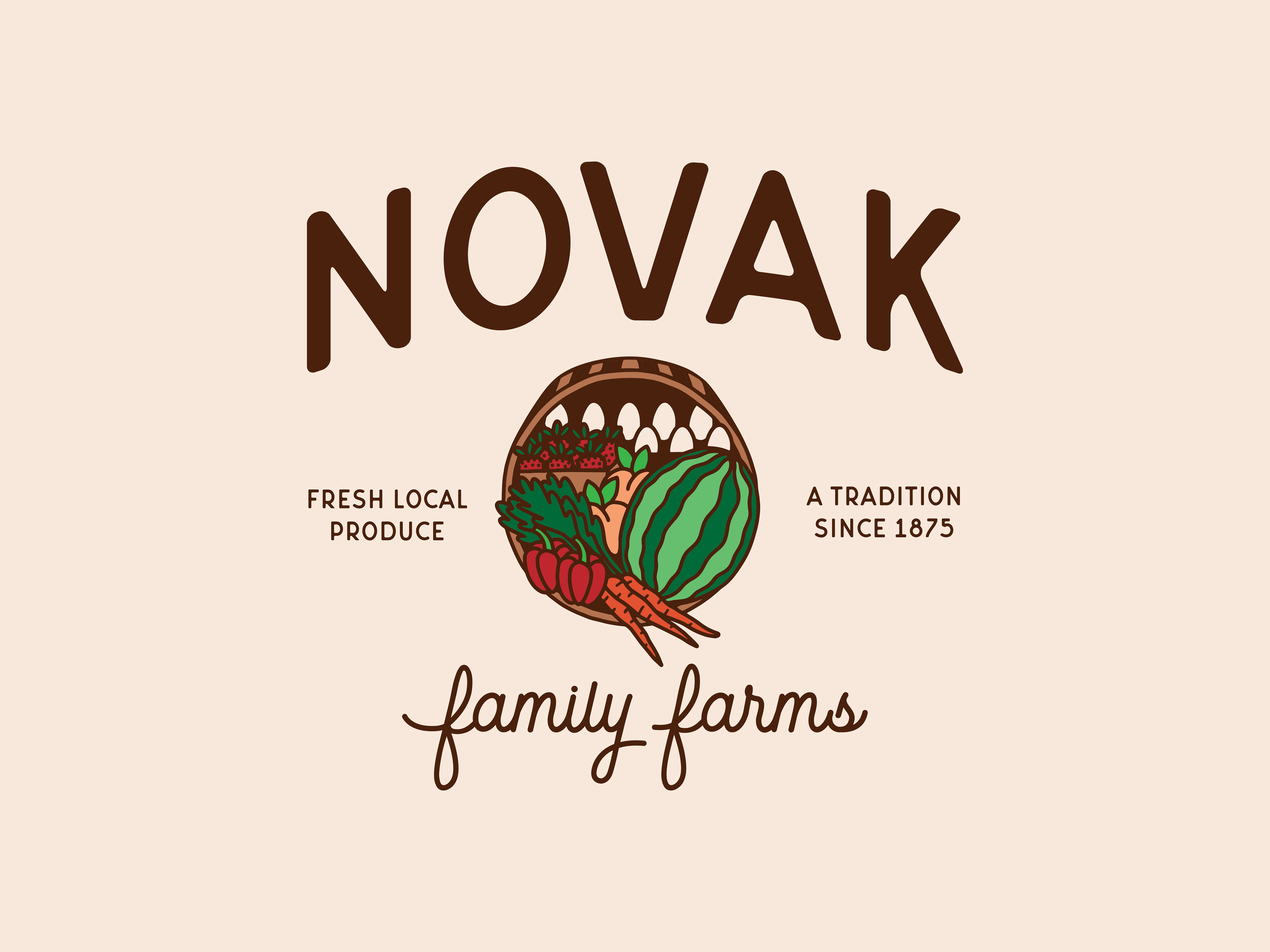
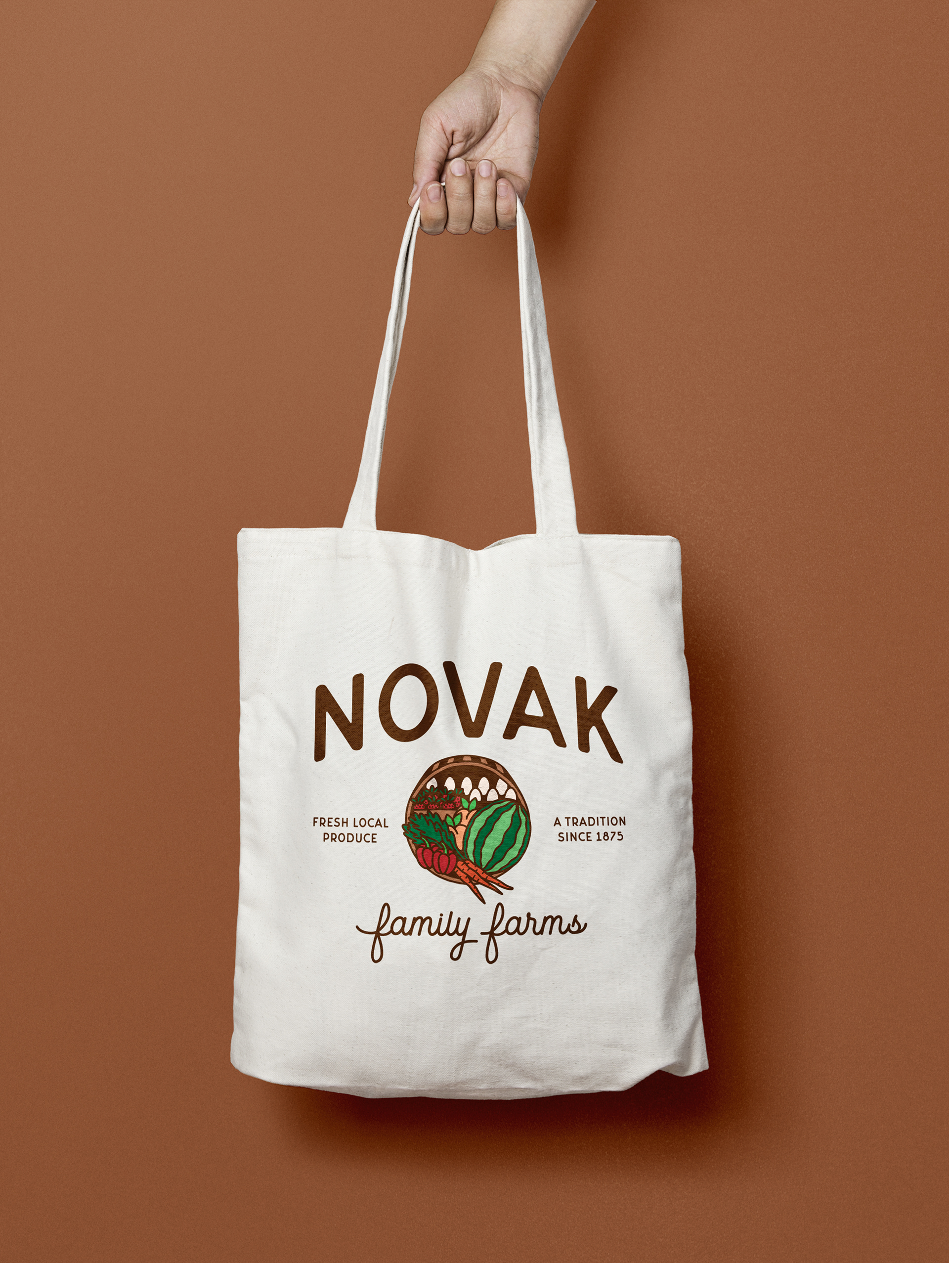
I am proud to reveal one of my latest freelance projects - a complete branding suite for Novak Family Farms! They are a small family farm raising fresh produce in the Iowa City Area.
Working with Kirsten on her business's visual identity was such a joy. After hearing the story of how they got started and where they were planning to go (big plans to expand, let me tell ya!) I knew they would need a logo that could accurately describe where they currently were at, but grow with them for the future.
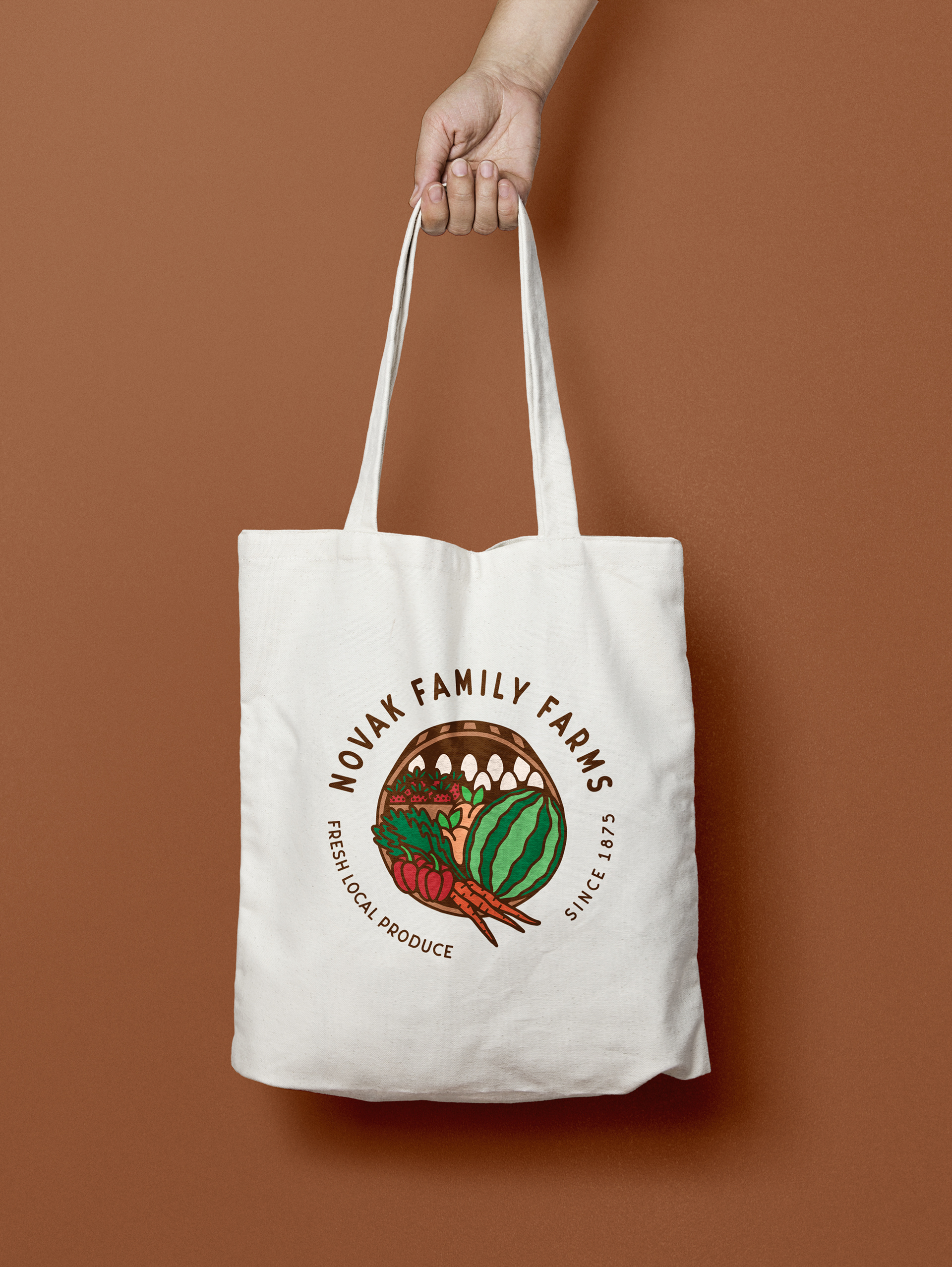
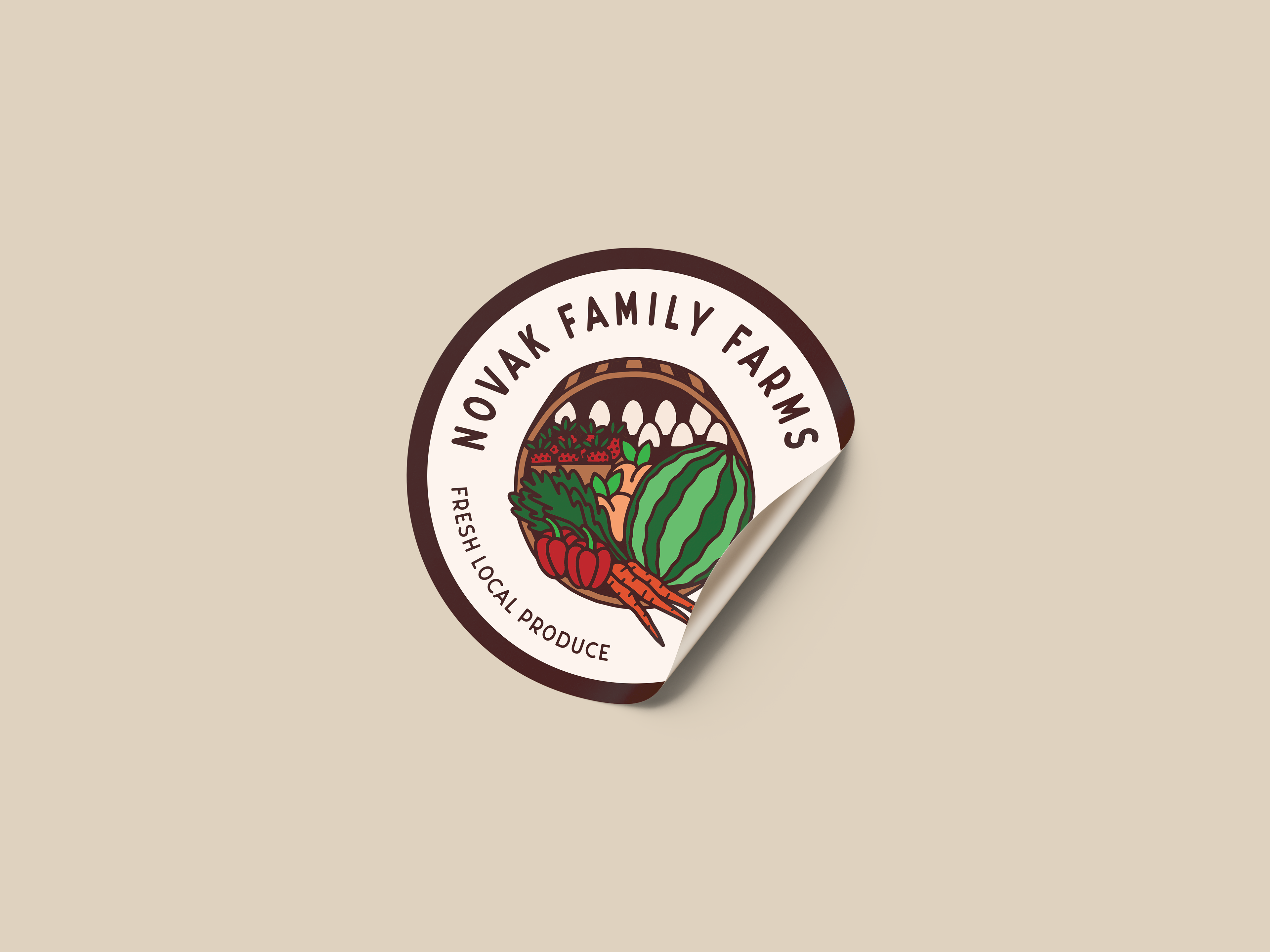
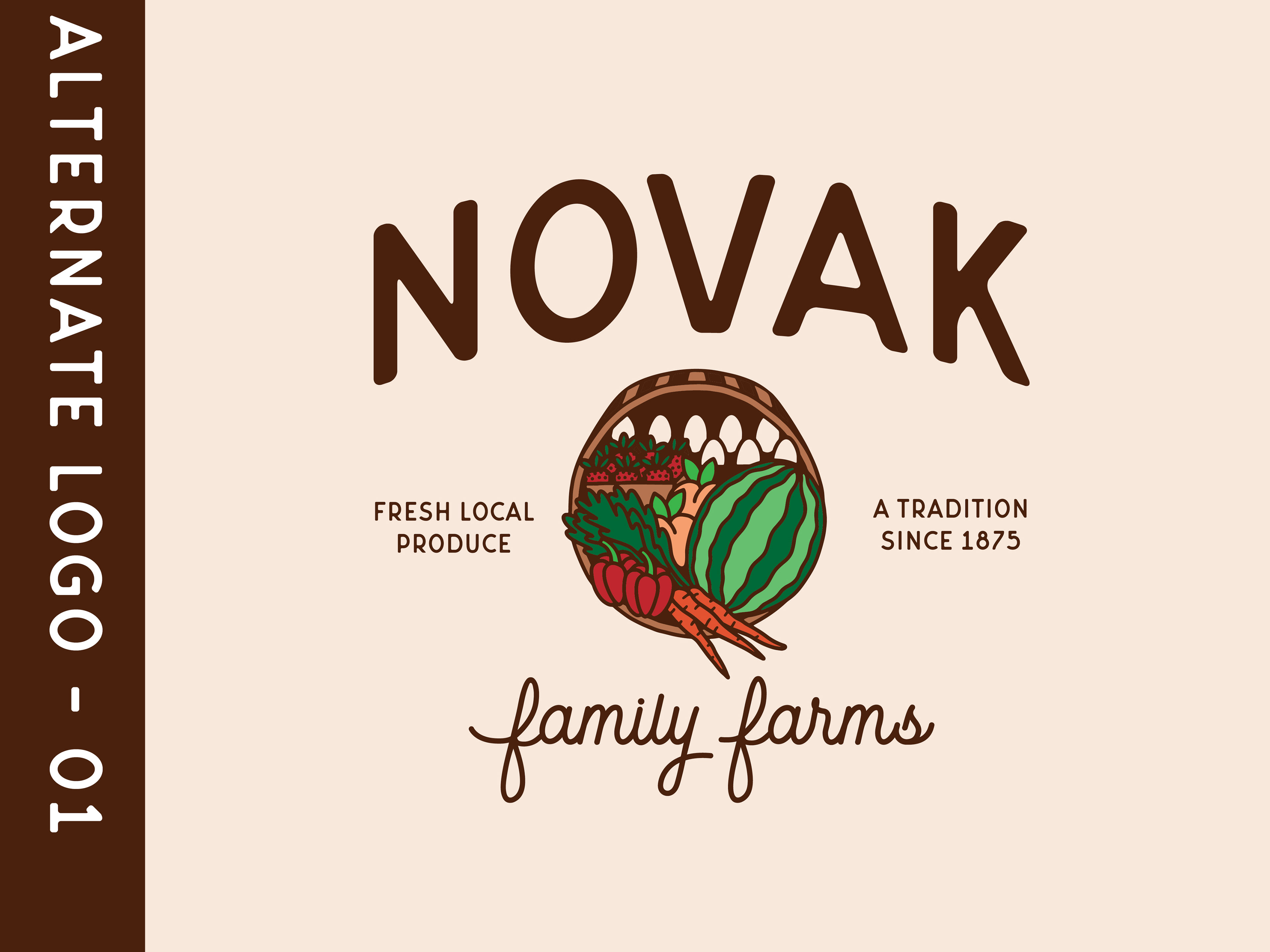
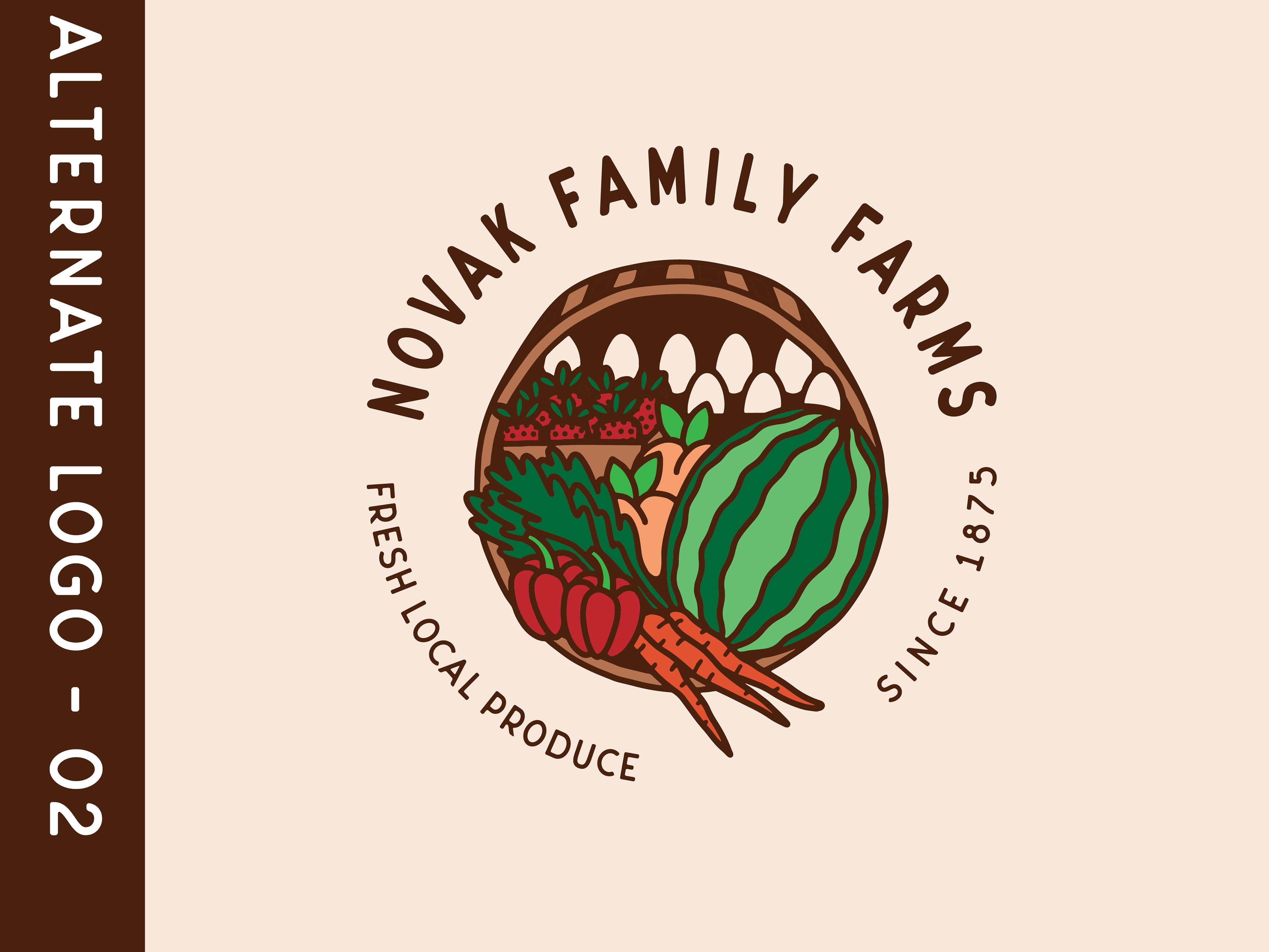
If they grow such a variety of items, how could I visually communicate the abundant variety of things they produce without limiting them to a particular specialty? Enter: the farm basket! A classic staple among produce farmers, the "farm box" is usually a subscription-system that allows you to get a variety of seasonal farm fresh goodies on a regular basis! By creating a hand-drawn basket full of fruits, veggies, and eggs for their logomark, it's clear that Novak Family Farms isn't just an egg-producer or a strawberry patch - but a delightful mix of all things nutritious and organic!
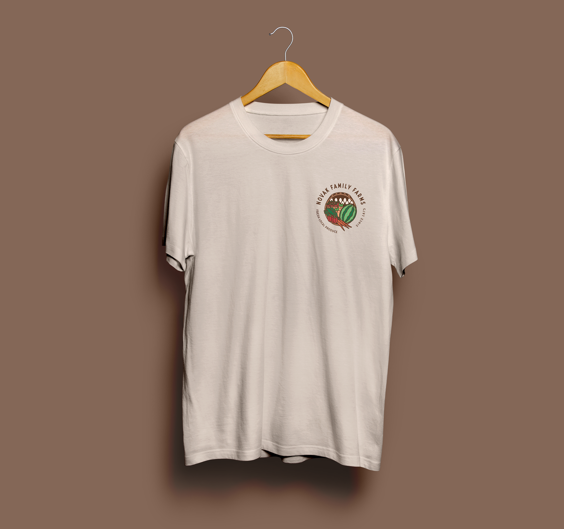
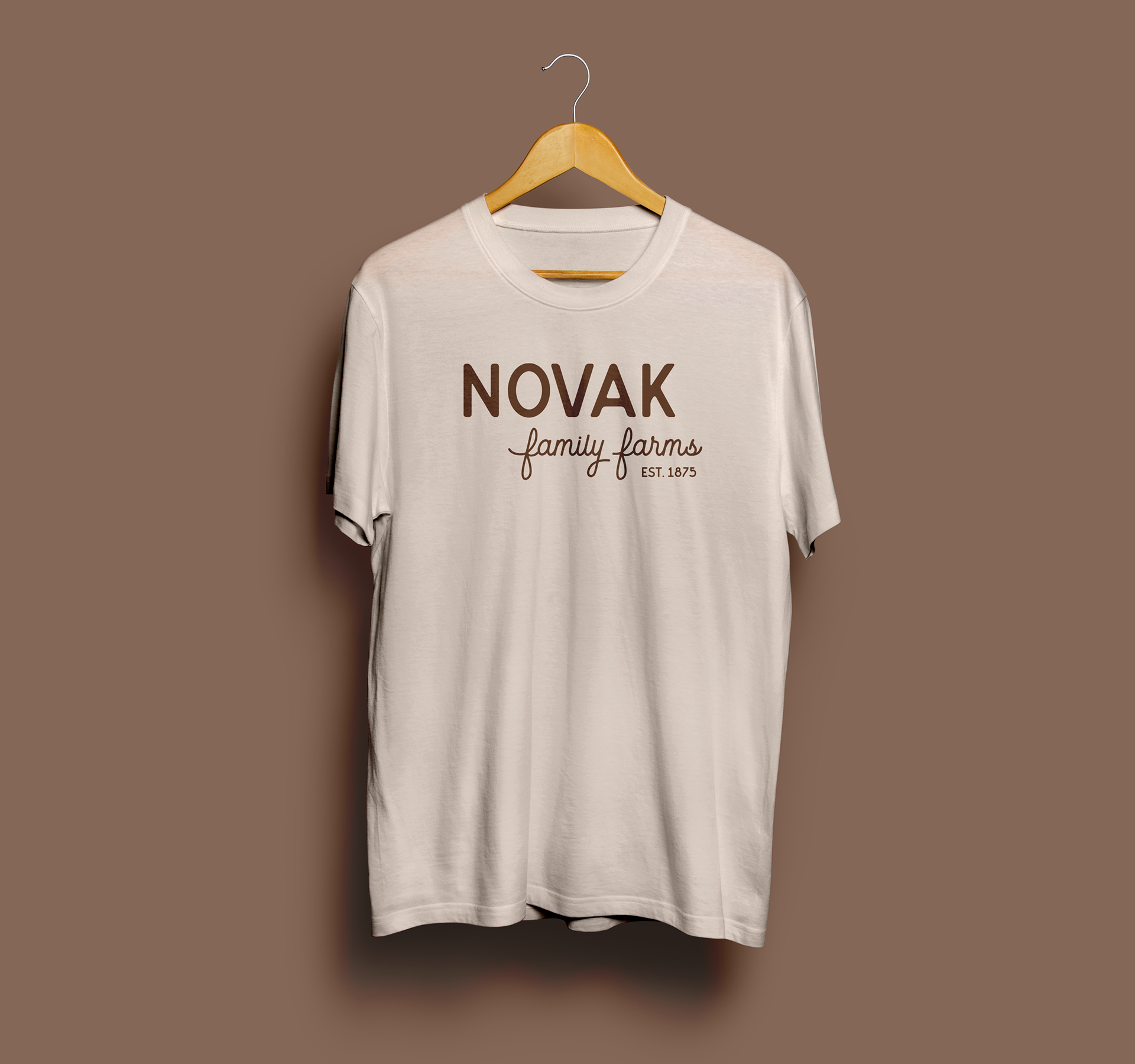
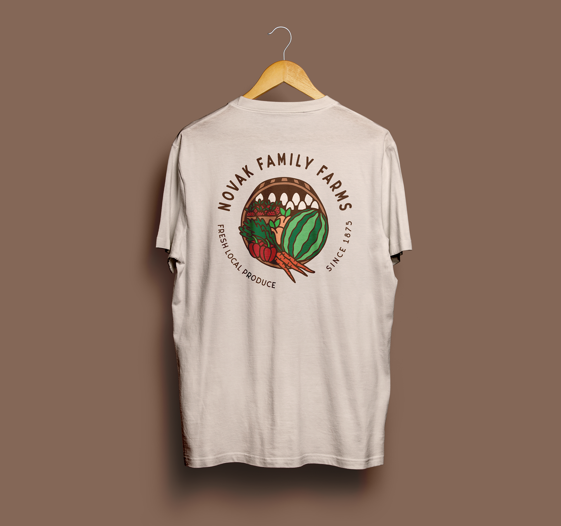
With the majority of their communication being word-of-mouth and social media posts, it was important to have responsive branding that could adapt for photo overlays or an effective way to easily communicate while maintaining brand consistency.
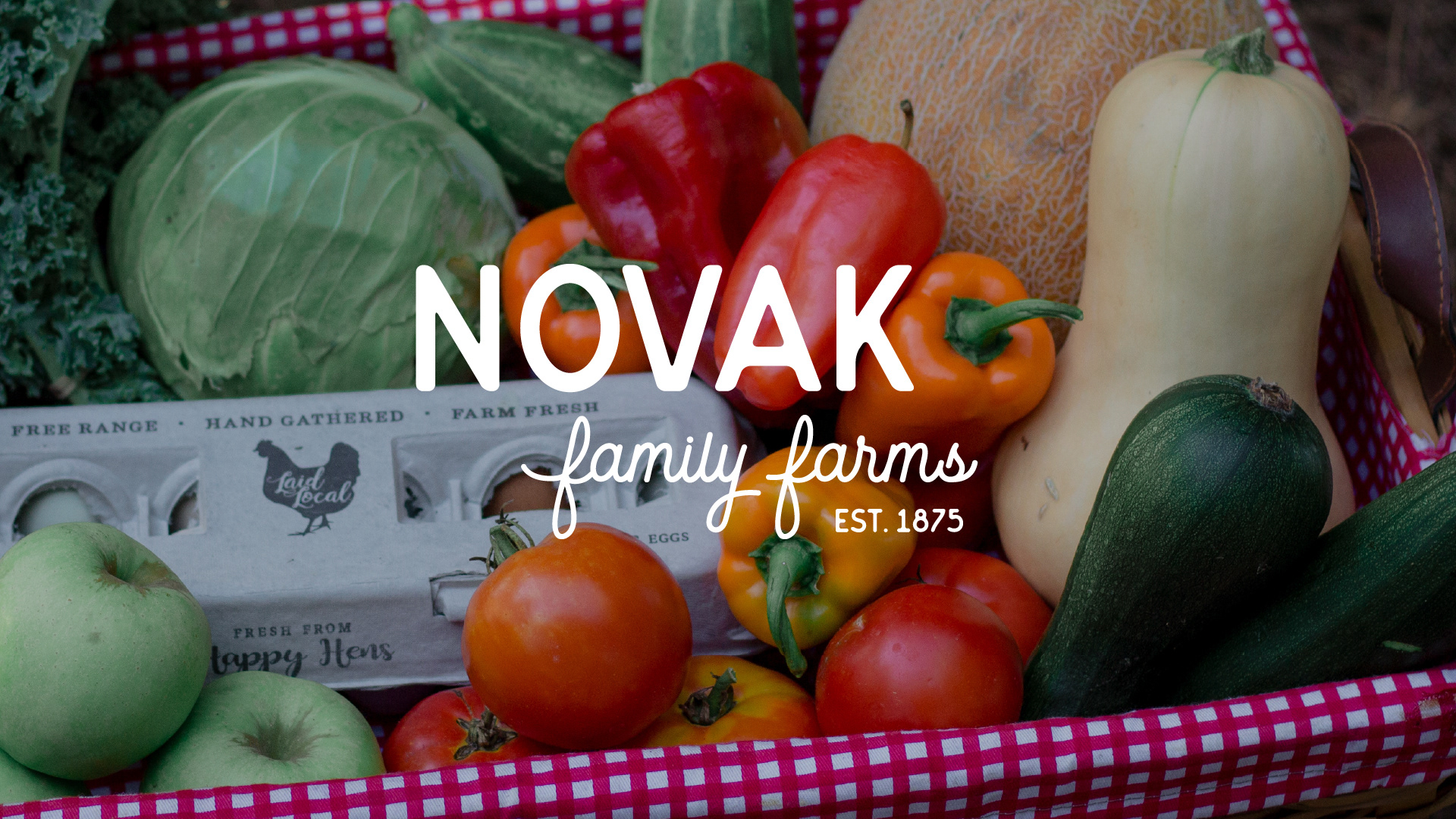
Novak Family Farms' mission is to raise nutritious, organic foods that can nourish its local community through family farming that respects nature. When they asked for a logo I knew they would not only need a brand identity that evokes the warm, organic presence of their business - but I would also need a wordmark simple enough to let the photos of their REAL produce shine!! I mean seriously, how good do those bell peppers look? YUM. Those definitely needed to be a part of the advertising strategy!
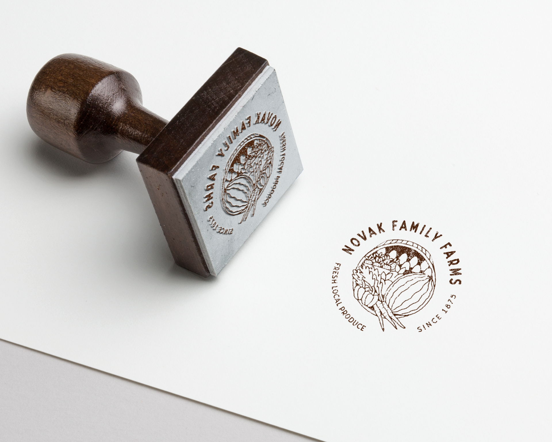
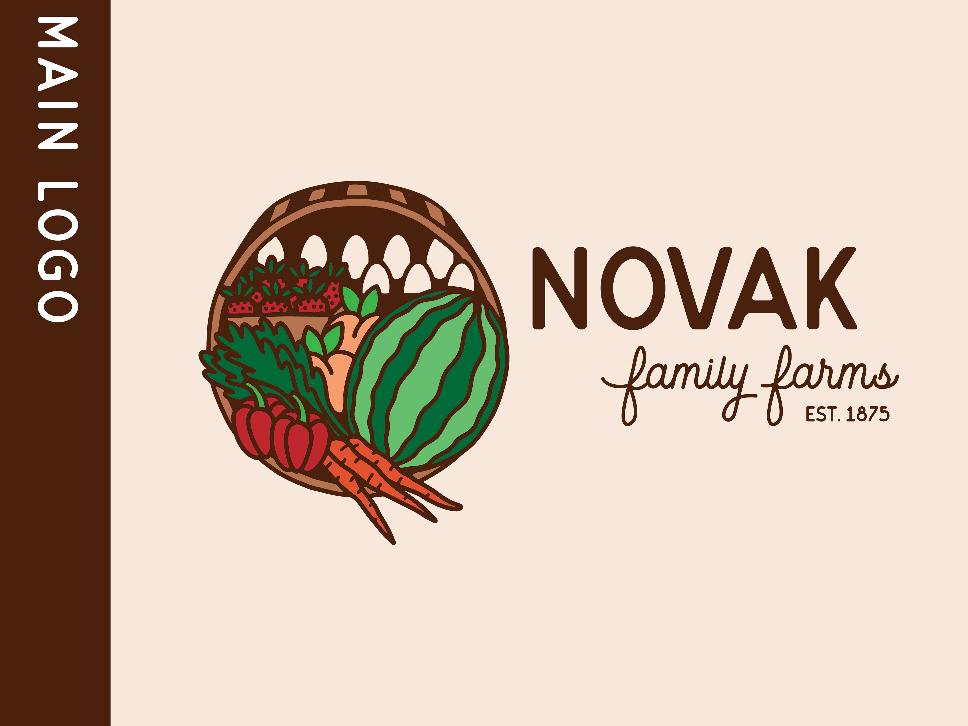
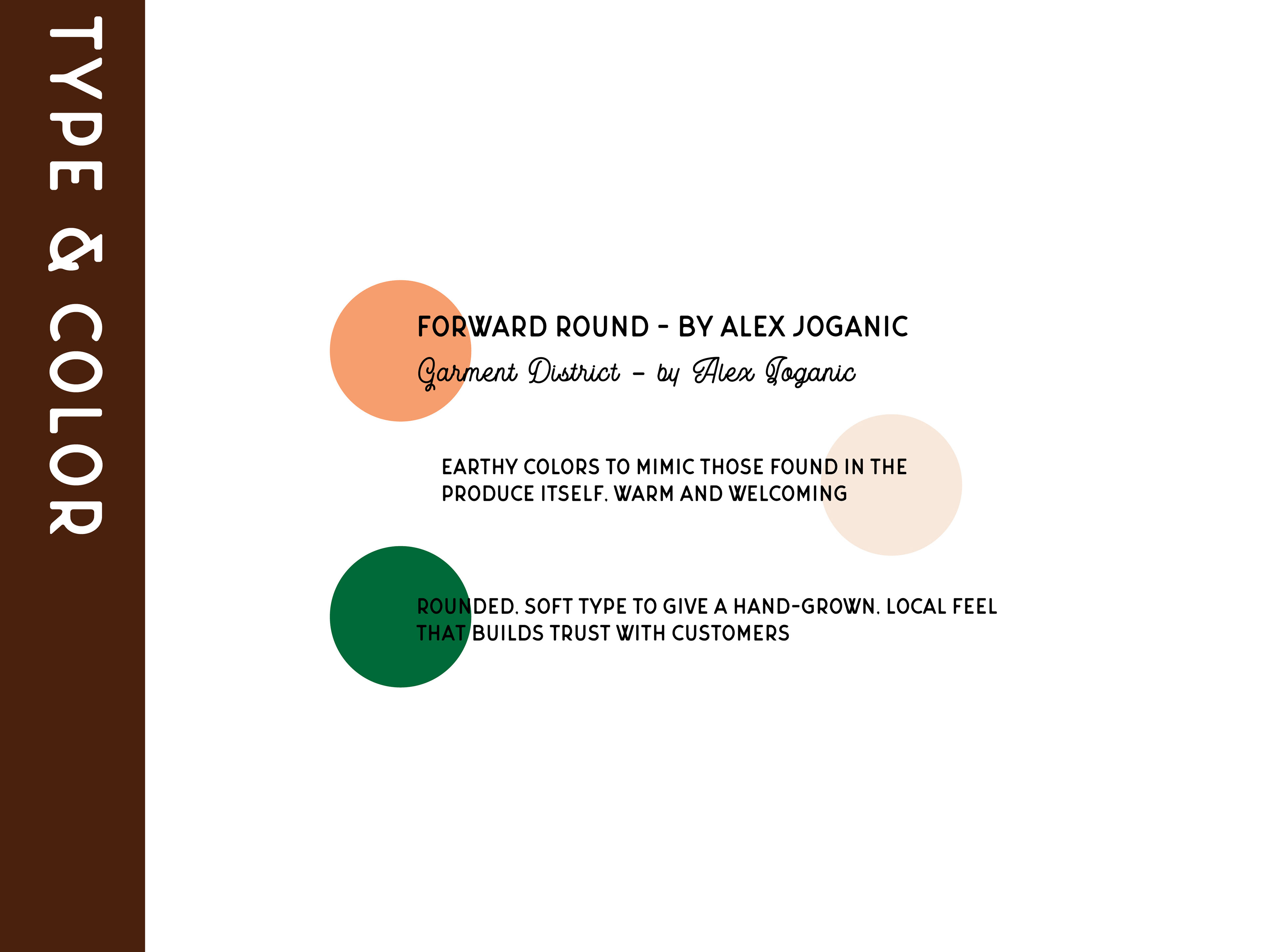
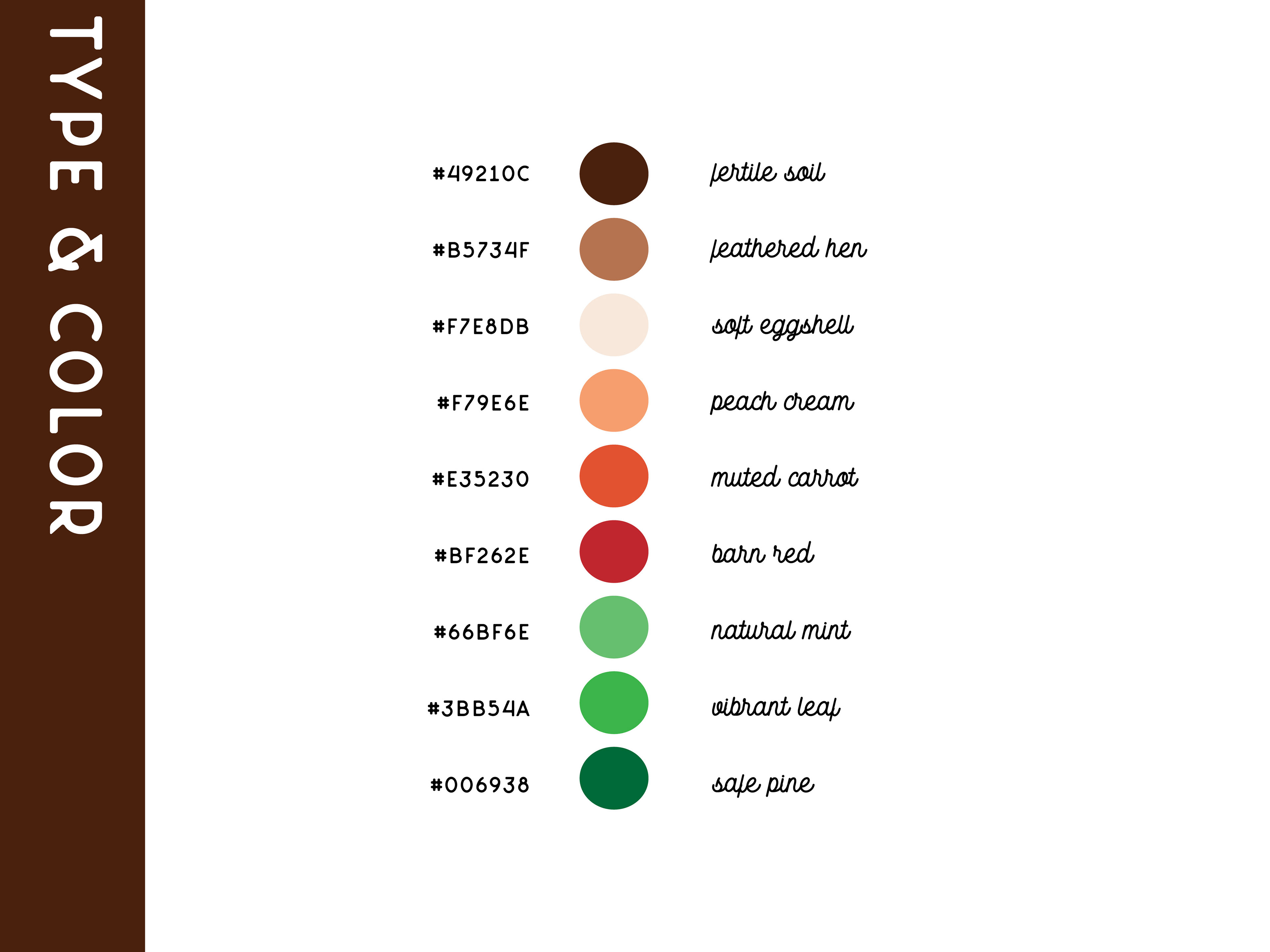
Also, huge shout out to Alex Joganic for the beautiful typefaces! I loved the warmth and personality they brought to this brand. Fun fact: the "f" in the logo type is custom - I wanted a little more flourish and legibility at smaller sizes (think cute lil stamps on their egg cartons!) so I added an ascending loop & flourish to the entrance stroke.