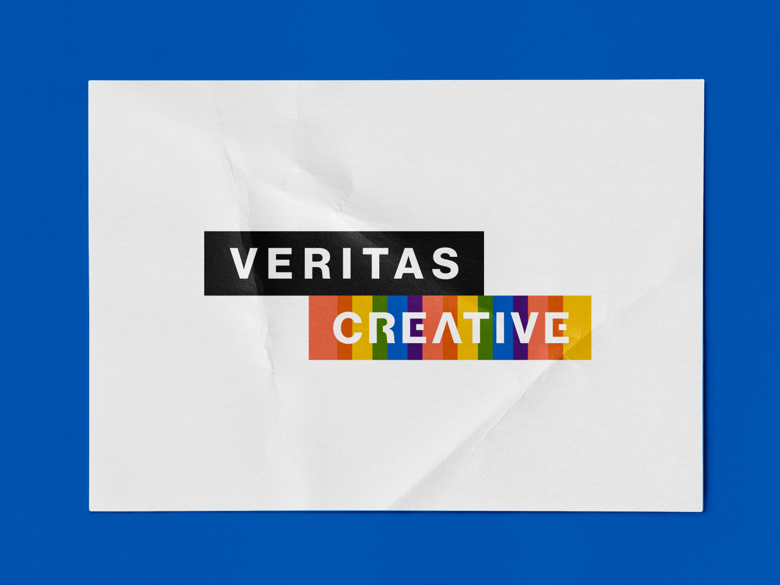
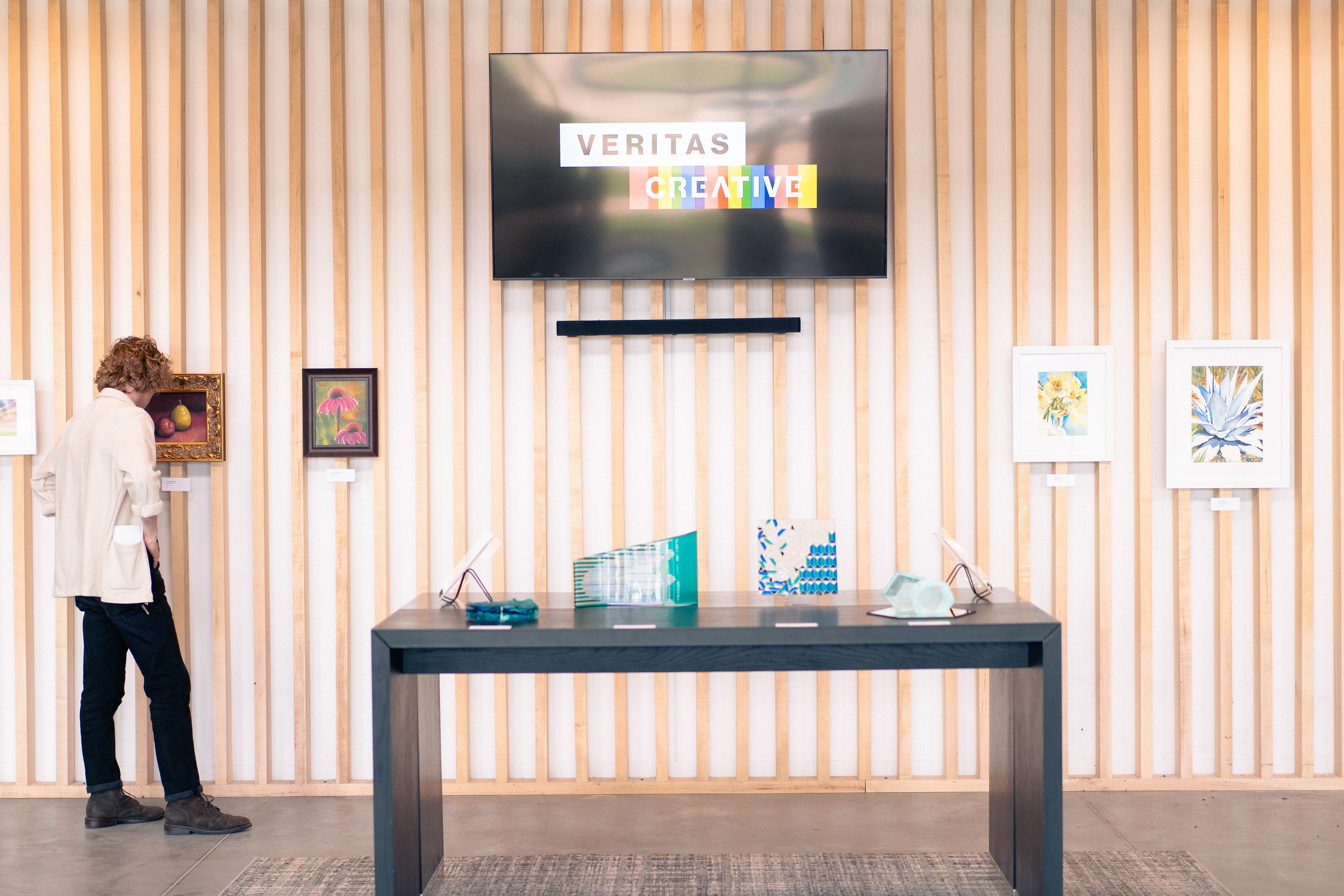
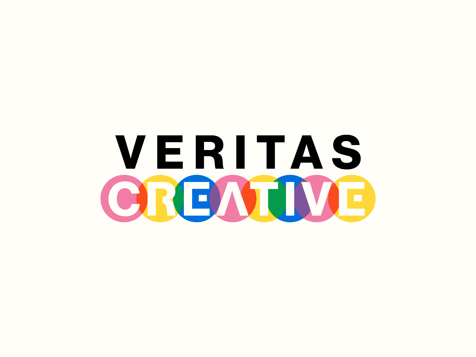
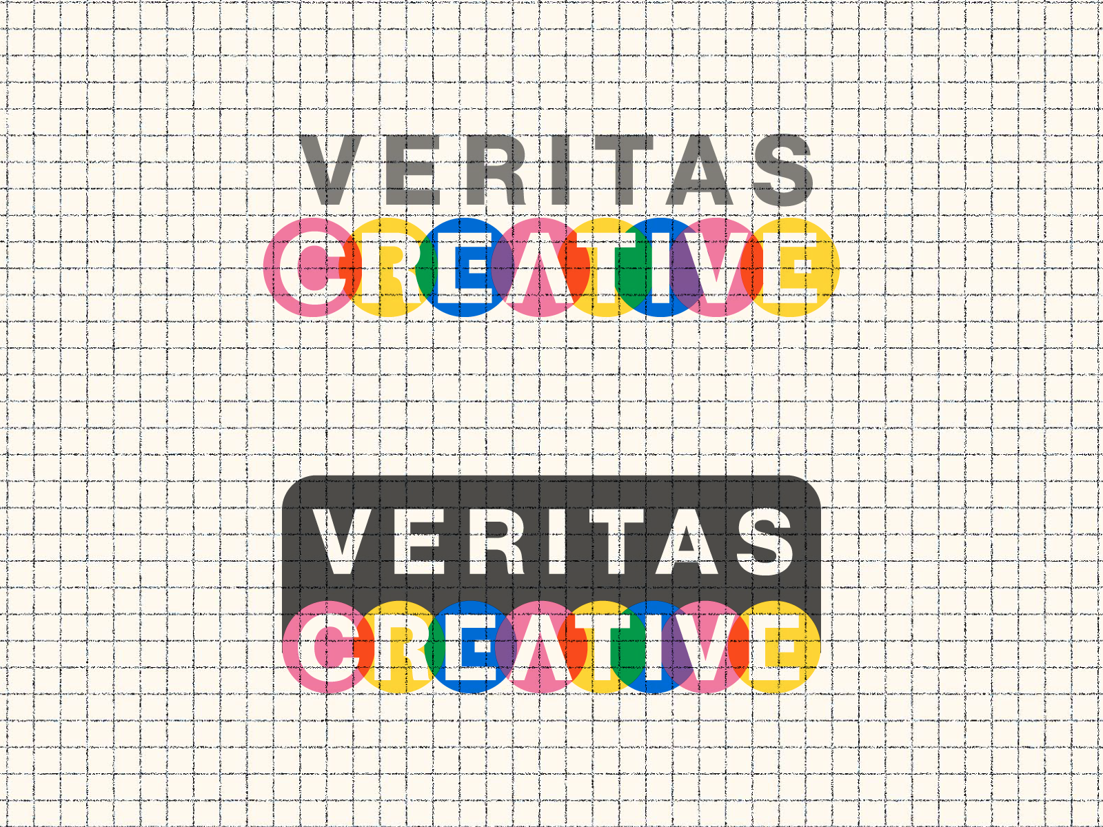
The official logo of Veritas Creative, an art open house created by local artists within the church, for any and all to enjoy. The color bars are a nod to the color spectrum/CMYK color space - color plays such a big role in creativity, so I thought it was a great theme to abstract for the logo!
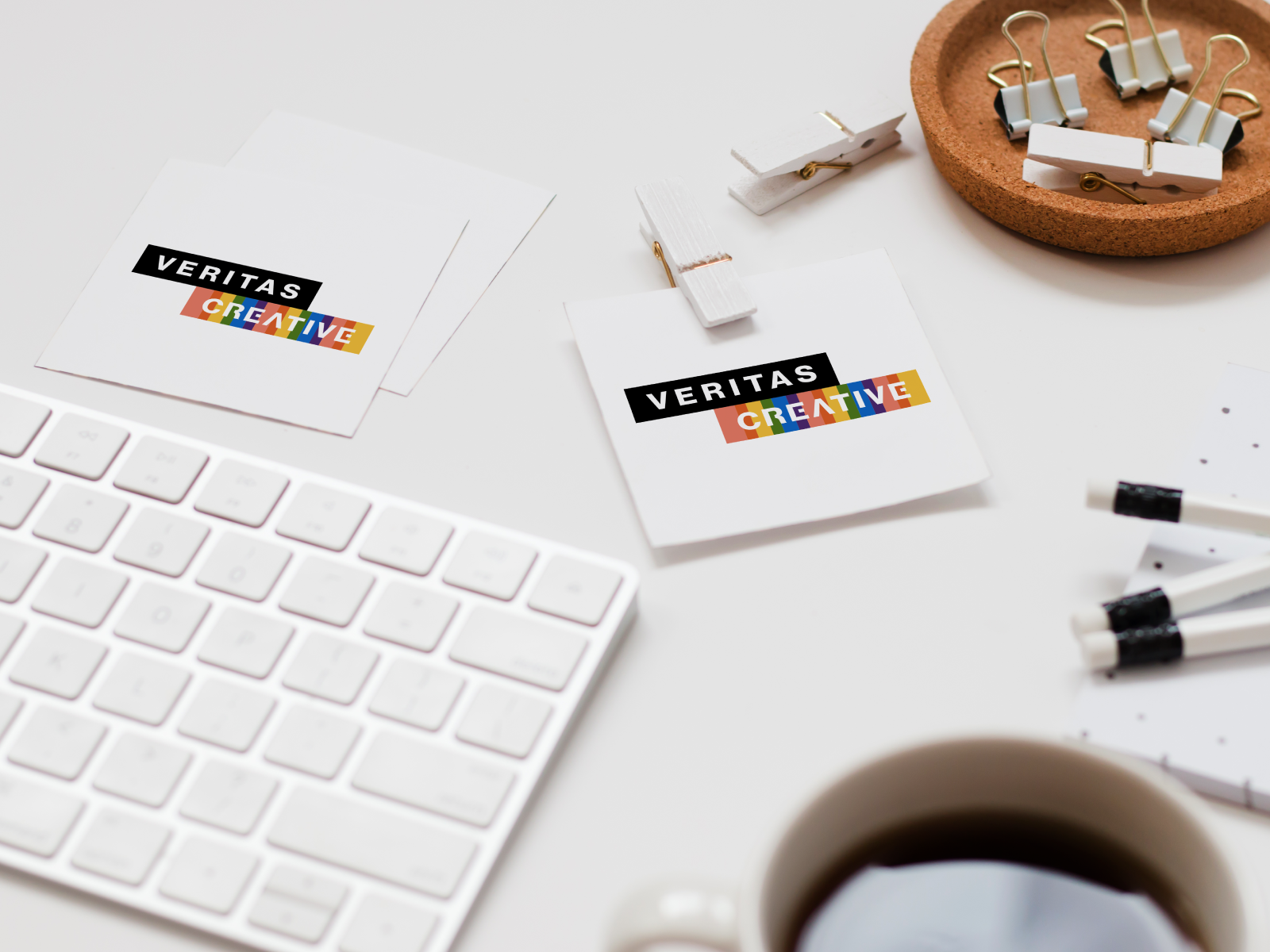
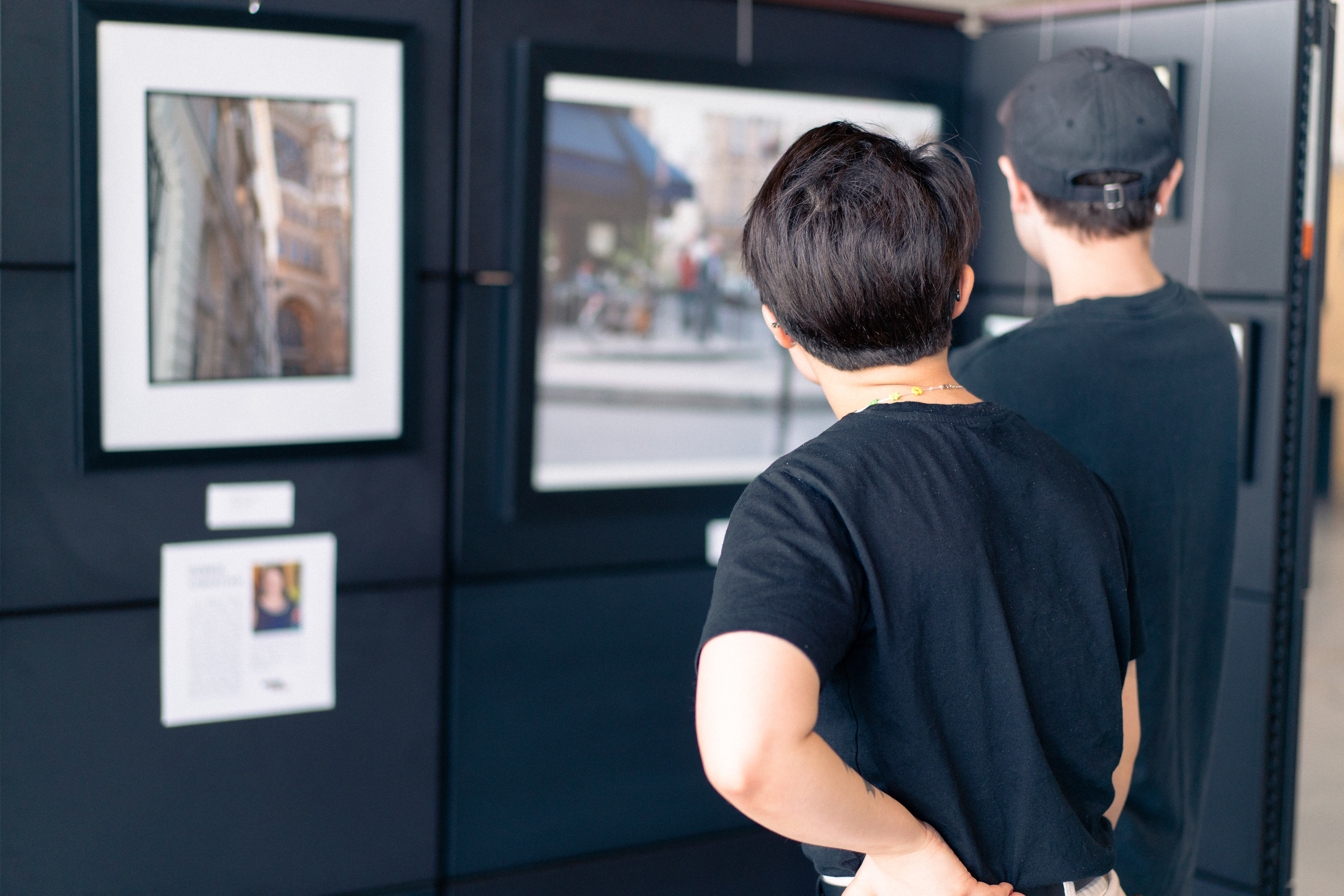
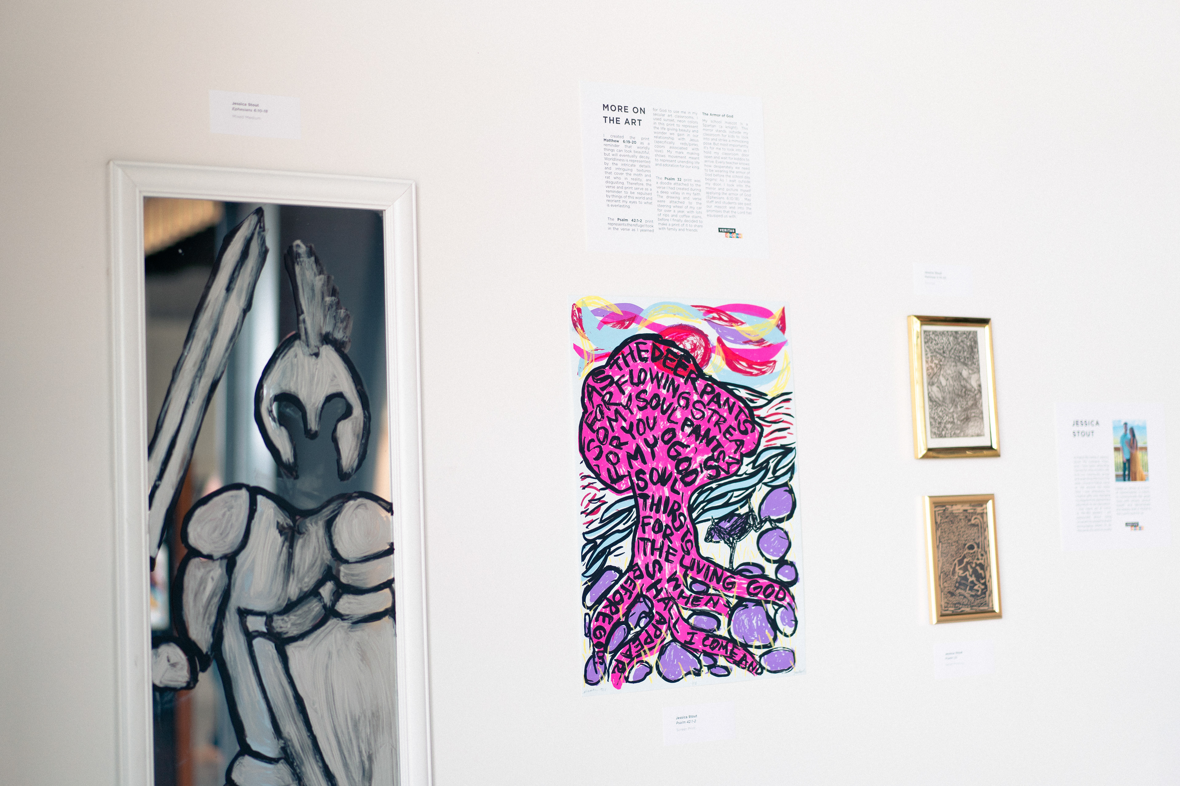
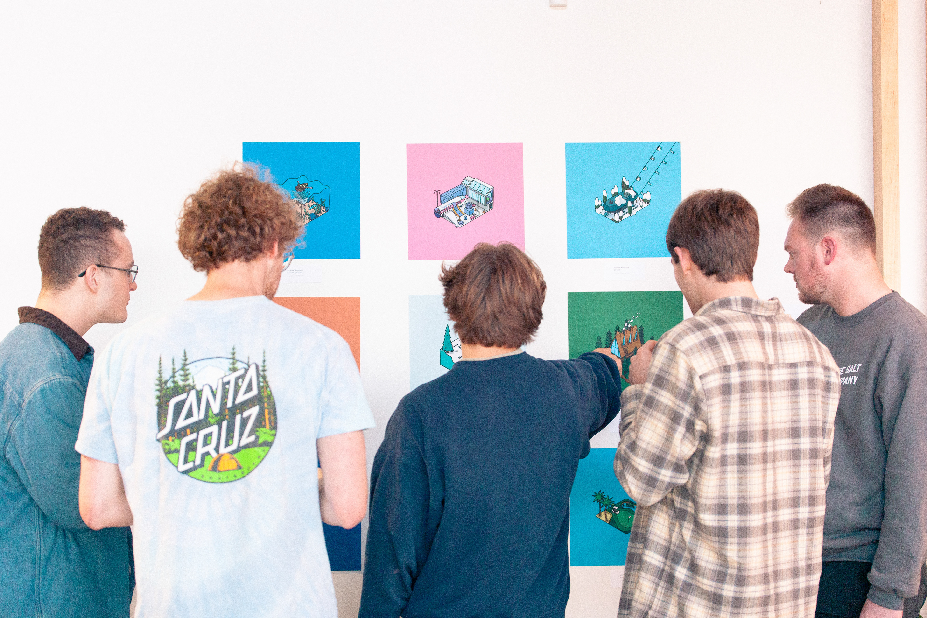
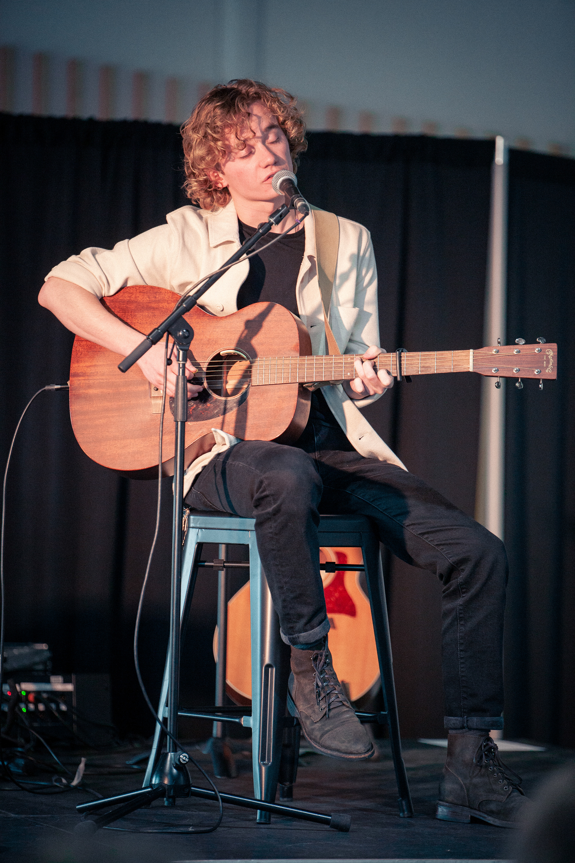
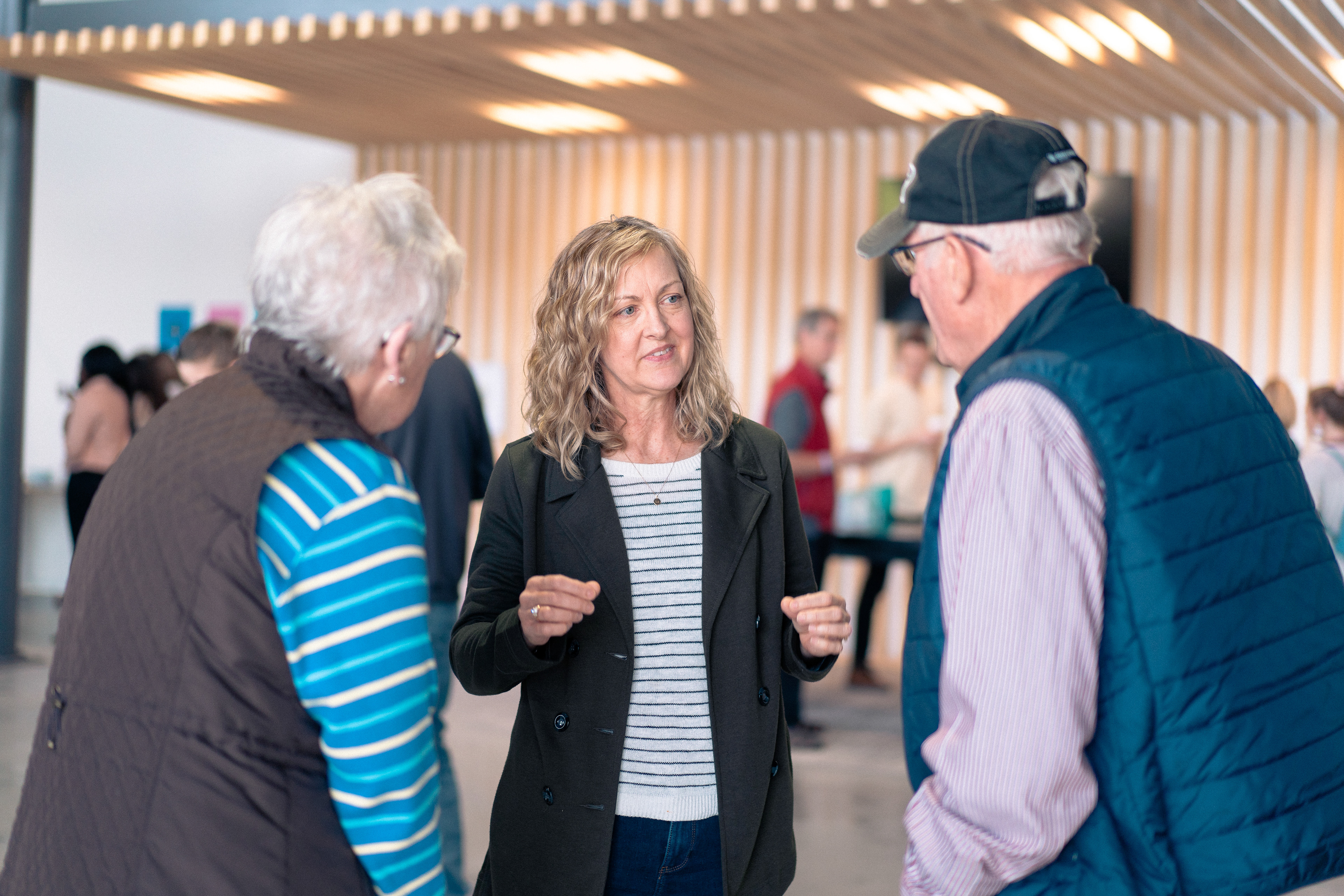
Some photos from the event...peep the branding [and artist bio layout also designed by yours truly] in action!
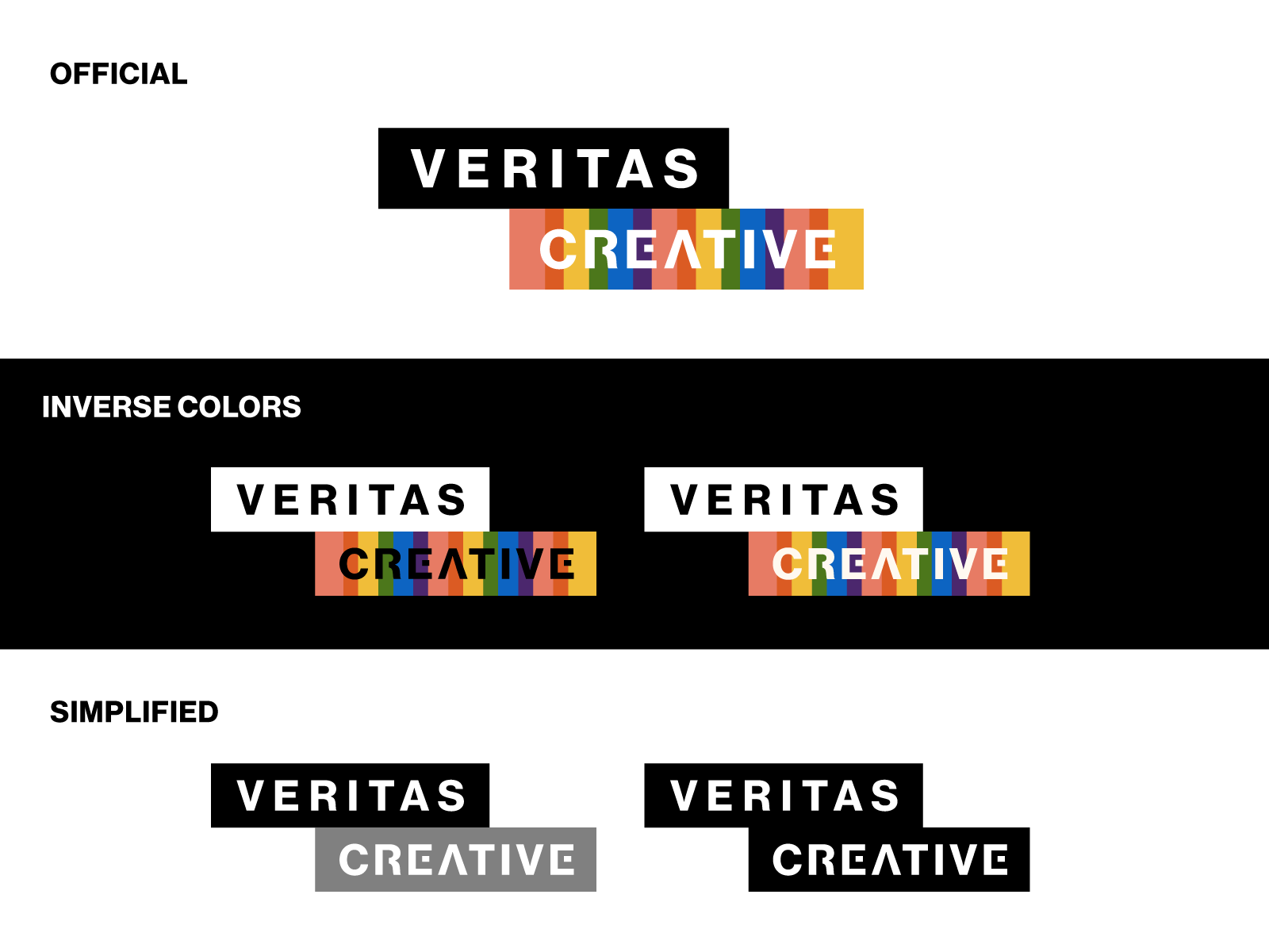
Compared to the unused marks you'll find below, for the final logo I toned down the colors to be a little more muted, giving a more mature look, appealing to a wider audience than just young adult creatives. We also ended up changing the circles into rectangles for a cleaner look to suit the visual identity of Veritas Church - although I still think as a standalone, the circles are my favorite!
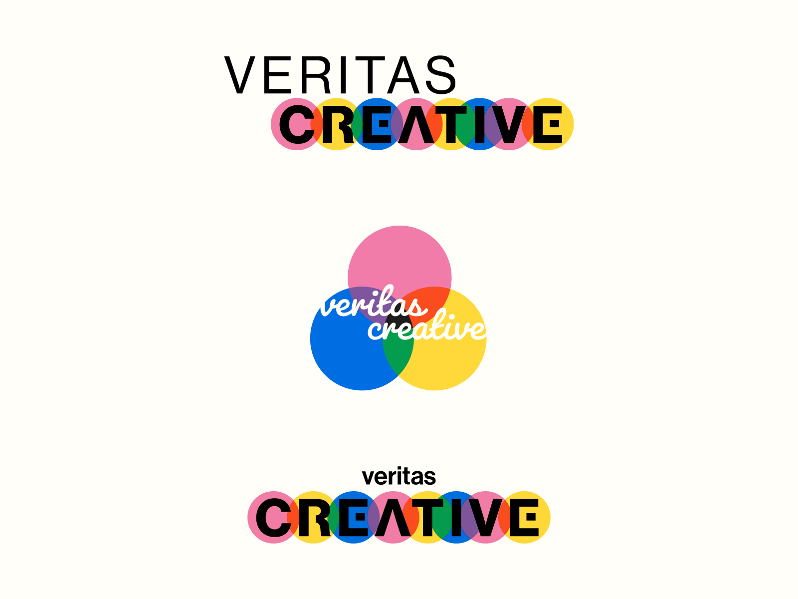
A few more iterations and alternate directions from the "initial concept" stage of designing.
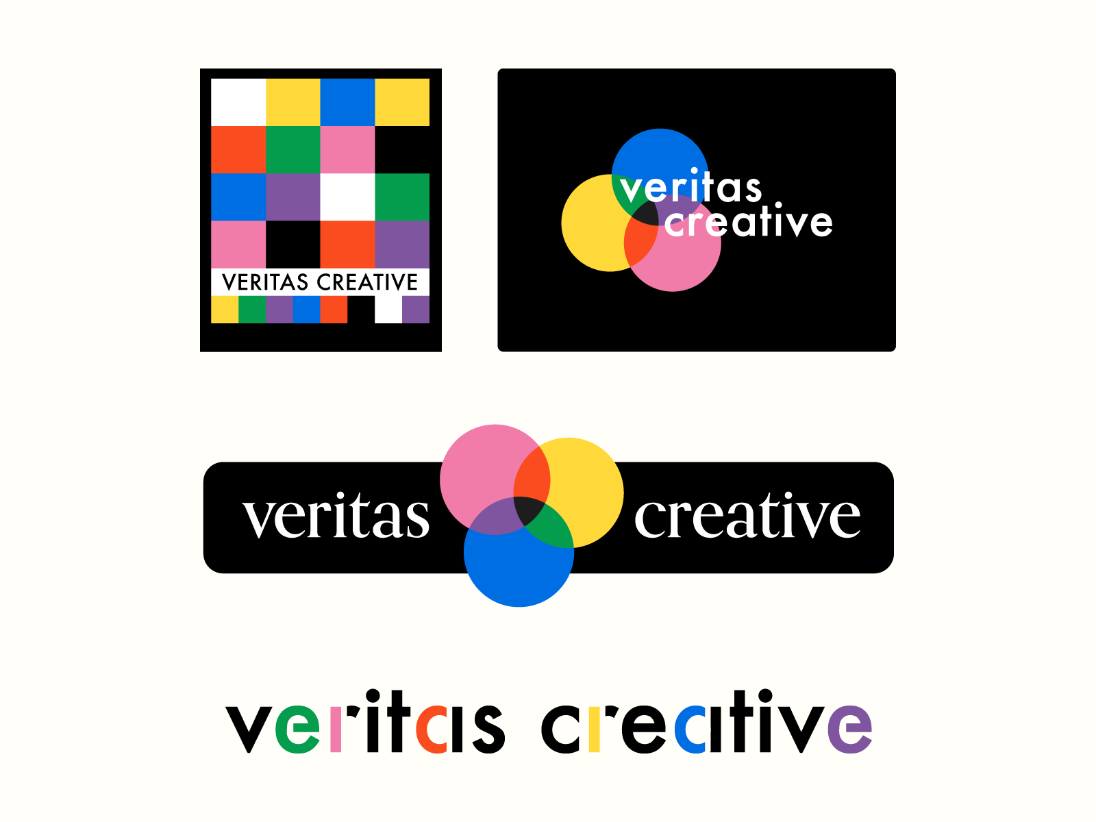
I created my own "graph paper" look as a nod to how so many ideas start in sketchbooks.... ultimately it was too textural and retro for this clean, modern church's branding.
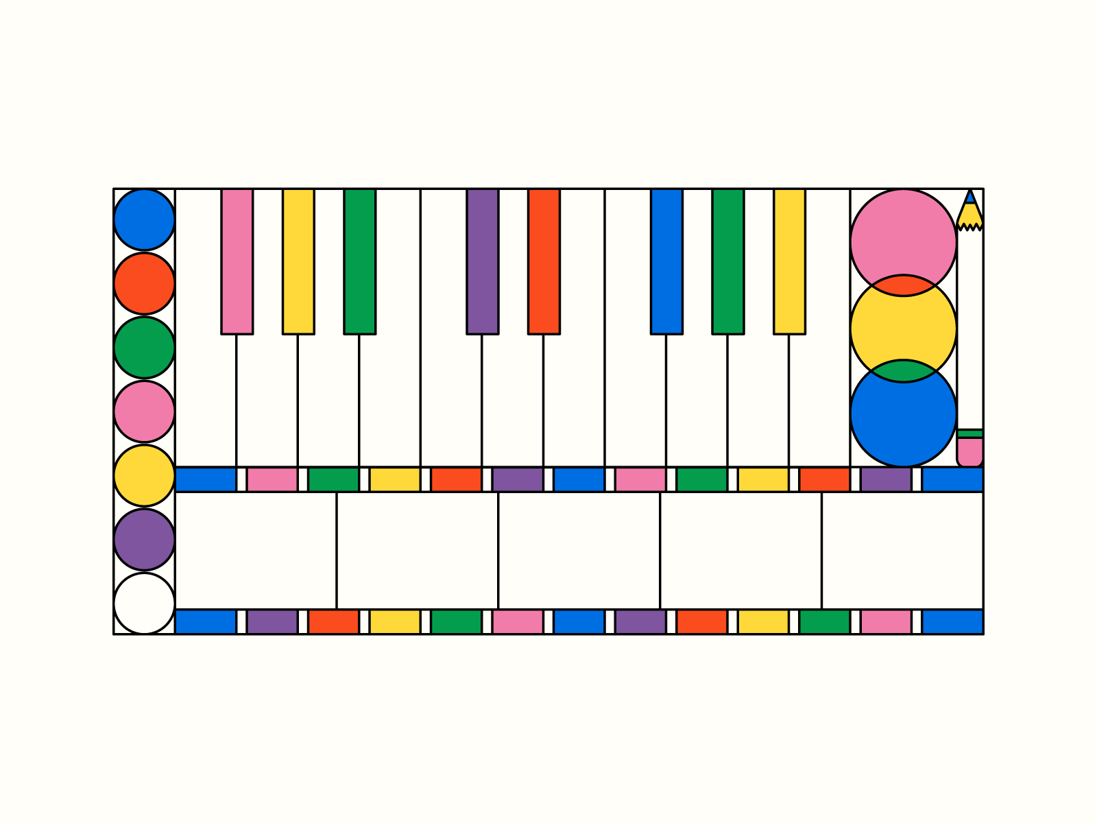
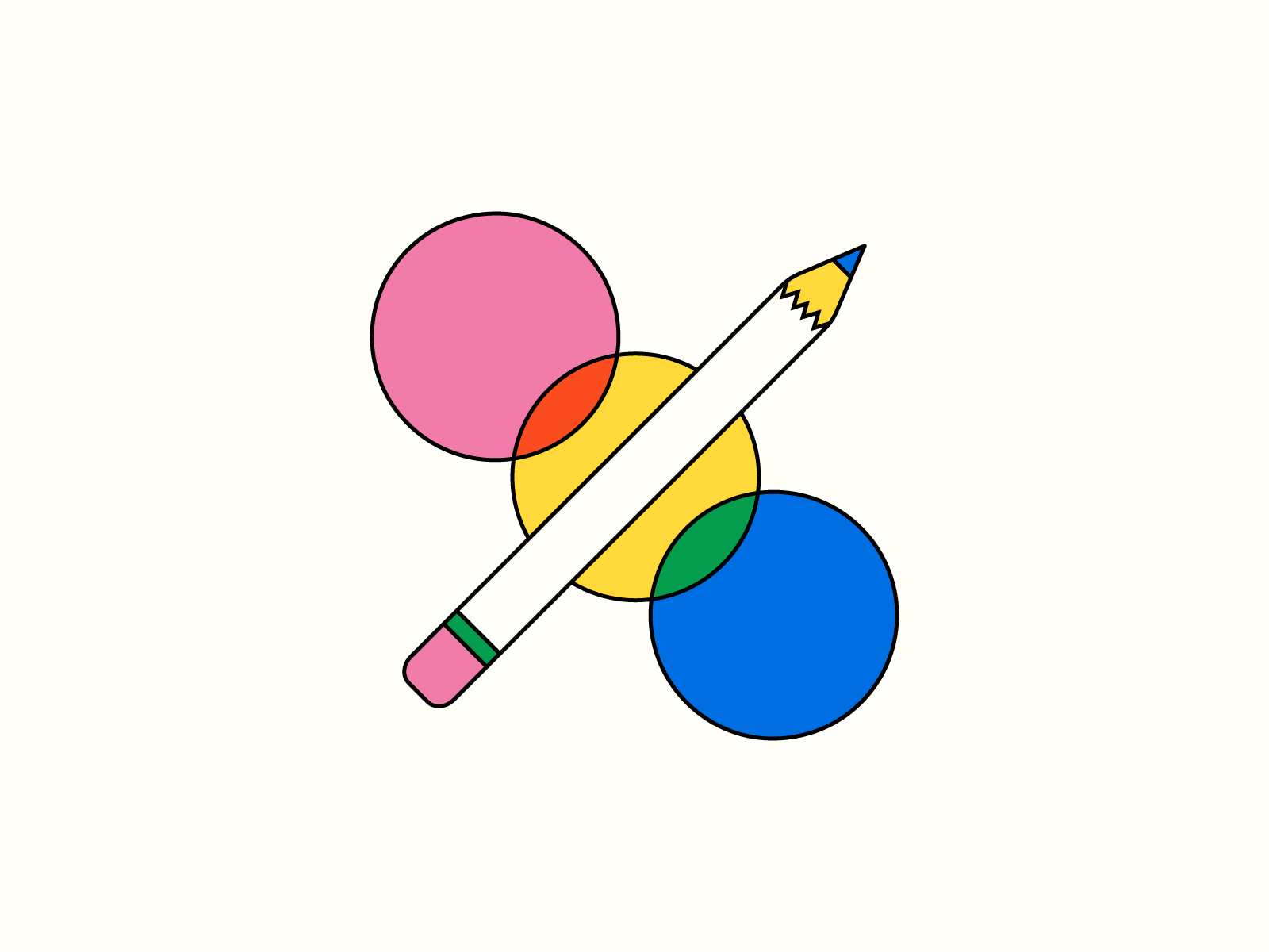
bonus: cute lil icon illustrations! see if you can spot all 5 creative tools: painter's palette, piano, film strip, cmyk circles, and a pencil.
Long live local art communities! Such a pleasure to design, event plan, and participate in.